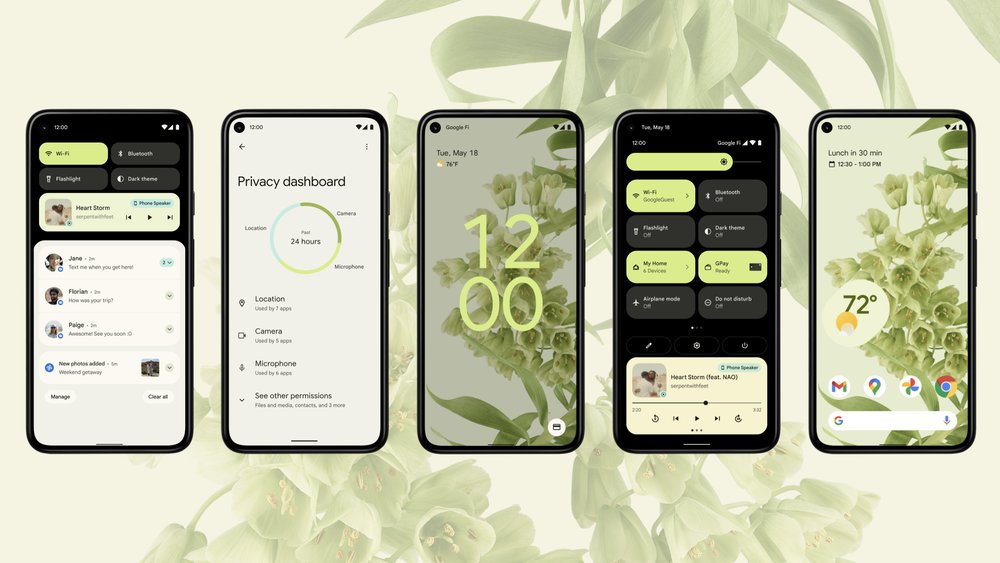
Android 12 was released about a month ago, and so far the overall feedback from the reviewers is generally positive.
If you’re curious, here are a selection of reviews to check out:
- Ron Amadeo’s Android 12 review at Ars Technica
- Manuel Vonau’s Android 12 review at Android Police
- Cameron Faulkner’s Android 12 review at The Verge
In general, they all praise Google’s new “Material You” design, and the new Privacy Dashboard feature. Ars also dives deep into some of the new behind-the-scenes features like the GKI, the Private Compute Core, and Android’s new Incremental File System.
Android definitely has a tendency to be less consistent in UI design, and it looks like Google really took their time in getting Material You working well.
The overall idea is that Android will pull colors from your home screen wallpaper and use them as various accent colors across the UI. This design goes so far as to (subtly) color backgrounds of apps and widgets to match the color pulled from your background. Android can also change the colors of certain widgets depending on where they are on the home screen to increase legibility no matter where they are positioned.
If you’d rather watch a video about Android 12, Marques Brownlee does a good one. This also showcases a lot of the Material You UI:


Leave a Reply
You must be logged in to post a comment.